Fitting data with error bars
Suppose you have data \((x_i,y_i)\), with uncertainties \(\sigma_i\) in the y-values. Let
\[
U_n = \sum_i \frac{x_i^n}{\sigma^2_i},
\qquad
W_n = \sum_i \frac{y_i \, x_i^n}{\sigma^2_{i} } ,
\]
and let
\[
D = U_0 U_2 - U_1^2 .
\]
Then the best fit line is given by
\[
slope = \frac{U_0 W_1 - U_1 W_0}{D},
\qquad
intercept = \frac{U_2 W_0 - U_1 W_1}{D},
\]
with uncertainties
\[
\sigma_{slope}^2 = \frac{U_0}{D},
\qquad
\sigma_{intercept}^2 = \frac{U_2}{D}.
\]
As part of your homework, you will write a function which implements this method.
Friday, June 30, 2017
Python Plotting Tutorial -- Part 7
Importing data from a text file
Text files ('.txt') are a simple and common way to store data from an experiment. These files can be generated from an Excel spreadsheet, generated by a Python script, or just typed in manually. Typically one lists the data in several columns, similar to a spreadsheet or table format. The characters separating each column are called the "delimiter". Common delimiters include commas, spaces, and tabs.
Here (data.txt) is an example of a text file containing a table of data. You can open it in any text editor (e.g. notepad, textedit, sublime text, etc). It should look like this:
When importing files into python, by default the computer expects the file to be located in the same folder as the script. Therefore, to use data.txt, it should be uploaded into a folder in your Jupyter account along with the script you want to use, like so:
Now you can reference the file within you python script. Numpy has a built in function specifically for this purpose, called np.genfromtxt (genfromtxt is a slightly more advanced version of np.loadtxt).
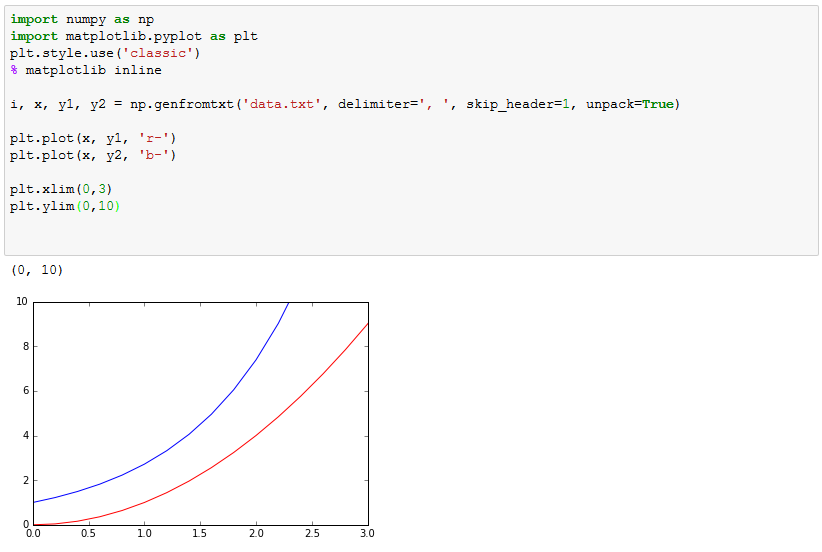
The function np.genfromtxt has one mandatory argument: the name of the file to be opened. However, several keyword arguments are important. You must specify the column delimiter (the default delimiter is whitespace). If you have a header in the text file, you should specify skip_header=1 to skip the first row of the file when importing. By default, the data will unpack into one large array, with each entry being a row of the table. However, we usually want to extract each column seperately. By specifying unpack=True, the output will be an array of the columns. By inputting this array into a list of names, each name will be equal to one of the columns. Try running the following code to see how this works.
In order to plot data from a text file, you simply need to use the generated arrays:
Exporting data to a text file
Numpy also makes it simple to generate a text file from an array. The function for this is np.savetxt. There are two mandatory arguments: the file name, and the array to save. Note that this function saves one array as a text file. It expects to be given an array of rows, so that each entry in the saved array is to be one row of the output file.
In order to take several array (each of equal length), and properly combine them for saving, you can use the function np.dstack ("depth stack"). This example shows how this works:
As you can see there is an unwanted extra layer to this array (the extra pair of square brackets). This can be gotten rid of using d[0] to get the first entry which is
Once you have set up the output array, it can be exported to a text file. The simplest case, with no options, looks like this:
To control the delimiters and the formatting of the numbers, you can include keyword arguments:
The output file then looks like:
For a more complicated example, here is the script which generated the file data.txt that we used in the previous part:
Text files ('.txt') are a simple and common way to store data from an experiment. These files can be generated from an Excel spreadsheet, generated by a Python script, or just typed in manually. Typically one lists the data in several columns, similar to a spreadsheet or table format. The characters separating each column are called the "delimiter". Common delimiters include commas, spaces, and tabs.
Here (data.txt) is an example of a text file containing a table of data. You can open it in any text editor (e.g. notepad, textedit, sublime text, etc). It should look like this:
When importing files into python, by default the computer expects the file to be located in the same folder as the script. Therefore, to use data.txt, it should be uploaded into a folder in your Jupyter account along with the script you want to use, like so:
Now you can reference the file within you python script. Numpy has a built in function specifically for this purpose, called np.genfromtxt (genfromtxt is a slightly more advanced version of np.loadtxt).
The function np.genfromtxt has one mandatory argument: the name of the file to be opened. However, several keyword arguments are important. You must specify the column delimiter (the default delimiter is whitespace). If you have a header in the text file, you should specify skip_header=1 to skip the first row of the file when importing. By default, the data will unpack into one large array, with each entry being a row of the table. However, we usually want to extract each column seperately. By specifying unpack=True, the output will be an array of the columns. By inputting this array into a list of names, each name will be equal to one of the columns. Try running the following code to see how this works.
In order to plot data from a text file, you simply need to use the generated arrays:
Exporting data to a text file
Numpy also makes it simple to generate a text file from an array. The function for this is np.savetxt. There are two mandatory arguments: the file name, and the array to save. Note that this function saves one array as a text file. It expects to be given an array of rows, so that each entry in the saved array is to be one row of the output file.
In order to take several array (each of equal length), and properly combine them for saving, you can use the function np.dstack ("depth stack"). This example shows how this works:
As you can see there is an unwanted extra layer to this array (the extra pair of square brackets). This can be gotten rid of using d[0] to get the first entry which is
Once you have set up the output array, it can be exported to a text file. The simplest case, with no options, looks like this:
The output file then looks like this:
To control the delimiters and the formatting of the numbers, you can include keyword arguments:
For a more complicated example, here is the script which generated the file data.txt that we used in the previous part:
Python Plotting Tutorial -- Part 6
Plotting with errorbars
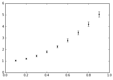
Plotting with errorbars is very simple in python. You just need to replace the plt.plot command with plt.errorbar. This function has the same functionality as plt.plot, except for slightly different syntax. When xerr and yerr arguments are included, errorbars automatically accompany the data points.
An example with no errorbars:
An example with vertical errorbars with uncertainty of 5% in the y data:
An example with randomly generated x and y errorbars:
Python Plotting Tutorial -- Part 5
Creating and Plotting a Best Fit Line
You can create a best fit line (also called a "least squares fitline" or "linear regression") to your data, using the function np.polyfit(xdata,ydata,degree). The first two arguments are arrays of the x-values and y-values to which you are fitting. The third argument is the degree of the polynomial used for fitting ("polyfit" = "polynomial fit"). We will use degree=1, which is a linear fit. Using degree=2, for example, would fit your data to a quadratic polynomial.
The np.polyfit function uses a "least squares fitting" technique similar to the method described in your lab manual.
In order to see what the form the output takes, consider the following example. In this case the input data will be an exactly straight line with the equation \(y=2x+1\) and the fitline will fit exactly.
Evidently, the output of np.polyfit is an array, which looks a lot like the (slope, intercept) of the linear input. And indeed, you can check with the documentation that the output of this function is an array of the polynomial coefficients for the best fit polynomial, ordered from highest power to lowest power.
Now apply this technique to a noisy data set. Here we find and print the slope and intercept of the best fit line. In this case we round the values to three decimal places, due to the number of significant figures in our data.
Finally, we can visualize the fitline by plotting the smooth fitline along with our data.
Tuesday, June 27, 2017
Python Plotting Tutorial -- Part 4
Making Prettier Plots
This example shows how to add custom titles, axis labels, range limits, tickmarks, and grid lines to your plot.


This example shows how to add custom titles, axis labels, range limits, tickmarks, and grid lines to your plot.
Python Plotting Tutorial -- Part 3
In this part, we'll see how to define functions and plot complex functions.
Python Plotting Tutorial -- Part 2
In this part we'll cover a few miscellaneous things...
Python Plotting Tutorial -- Part 1
Here's a script which makes a simple plot in python. First look at the example, then we'll break it down line by line.
Input:

Output:

Ok, let's break it down.
Input:
Output:
Ok, let's break it down.
Python Programming on the UCSC Jupyter Hub
We have set each of you up with an online tool for using the Python
programming language. Python is easy to use, and is a powerful tool for
plotting and data analysis. To log in visit:
http://phys133.ucsc.edu
username: your ucsc username (i.e. username@ucsc.edu)
pwd: your ucsc blue password
-- To create a new folder, click New > Folder in the top right.
-- To create a python script, click New > (Notebook) Python 3 in the top right.
-- To run your script, press Ctrl+Enter.
-- Please Shutdown all of your running processes before logging off or closing the window.
Check out the Python Plotting Tutorial posts to get started!
Subscribe to:
Comments (Atom)


